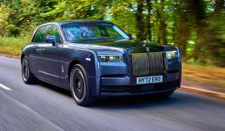
How to design a car (part five): the dashboard
Form and function are both critical in the design of a car’s dashboard but current trends are putting cost ahead of safety, argues Stevens
Back in the days of horse-drawn vehicles, those who sat on the seat at the front of the carriage endured a pretty unpleasant experience in bad weather when the horse threw up water and mud from its hooves. Country people fitted a barrier of either wood, leather or sacking to stop this muck from being ‘dashed up’. The first known use of the term dash-board (hyphenated in those days) dates from 1847 and it was carried over when carriages became horseless. One of the earliest automobiles was called the ‘Curved Dash’ Oldsmobile, a name derived from a small horse-drawn buggy.
This panel in front of the driver and passenger became a sensible place to fit various bits and pieces that the early motor car needed; there were switches, little dash-pots for oiling parts of the engine or chassis and, later, instruments. Since all cars built at the beginning of the past century were fundamentally unreliable the driver was required to keep an eye on temperatures, pressures, oil feeds, levels of liquids, etc, even though there was not much he could do about bad news except stop!
> How to design a car (part four): head and tail lights
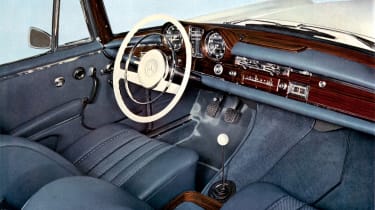
By the 1920s the dashboard was a grand piece of either wood or aluminium and very much the focus of attention. There’d be a huge number of gauges or instruments, a multitude of switches (often unmarked), a maker’s plaque and often a Saint Christopher for those who had more faith in an ancient traveller than in the manufacturer. The layout was often chaotic with a wide variety of unmatched instruments, bezels and graphic styles. It was the American cars of the 1940s and 50s that became much more style-conscious, featuring Art Deco layouts with highly creative graphic styles for both letters and numbers.
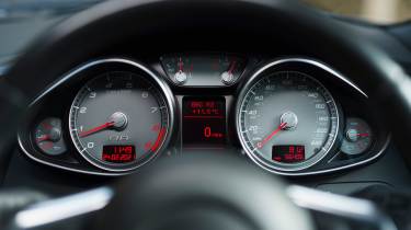
It wasn’t until 1959 that there was a move away from classic circular dials for instruments: both De Soto and Buick introduced the ‘ribbon style’ speedometer where the needle moved horizontally across a narrow strip of numbers; sometimes a rotating drum behind the needle gave the appearance of the background changing from black to red. The 1959 Mercedes ‘Fintail’ turned the idea through 90 degrees and had a needle that moved vertically upwards as speed increased. Closer to home, in the early 1960s the Austin and Morris 1100 had rather cheap-looking horizontal ribbon speedometers, though they had become something of a dead end by that time.
For a period in the 1980s and ’90s, large LCD or Liquid Crystal Displays were used for the digital speedometers of a number of cars. At Lotus, when we discussed instrument displays, there was a common feeling that what the keen driver needed was to be able to quickly see a rate of change of the position of a rotating needle: quicker and safer than staring at changing numbers. In 1983, Vauxhall and Opel’s Monza model and a few others presented the rev-counter, or the ‘engine revolution speed indicator’ as the pedantic liked to say, as a kind of vertical bar graph that looked like a torque curve. There were two objectives here: one was to give the appearance of modernity and the other was to save money because conventional instruments were, and still are, expensive pieces.
In the late 1990s Lexus developed a stunning piece of ‘theatre’ for its instrument display. When the driver switched on the ignition the display went through a number of separate phases before showing that it was ready for your next command. I always found this production to be quite charming.
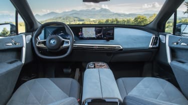
Passenger safety requirements such as driver and passenger head impact regulations, which dictate the edge radii and protrusion of any part of the car’s interior, have an influence on facia and switchgear design. Flick-up and down switches, push button switches and rotary switches can still be used, though they can tend to look like the controls from an ancient Belling electric cooker. Around the turn of the last century, to get rid of all these switches, BMW thought to captivate buyers with its iDrive system. The driver was expected to look at a central screen whilst rotating and/or pushing a large circular knob, like something off a cheap Korean hi-fi, in order to carry out even simple tasks like turning up the cabin heat. It wasn’t particularly well received…
Then came the wretched touchscreen. The idea was comparatively low-cost and came from mobile phone technology. A number of different screen displays can be called up to control most driving functions. Anyone who has tried to text whilst travelling on a British train or rural bus will know how hopeless the results of typing a simple message can be. To be in charge of a two-ton vehicle at speed with one hand, whilst attempting to alter some important control with the other seems to me to be rather stupid.
One of the main problems with the touchscreen is that the user gets no feedback from their action, once again requiring the driver to take his or her eyes off the road. And who doesn’t like the feel of a nice switch going ‘click’ so that you know that you have initiated the desired response!
Countering this we have head-up displays, as initially used on fighter jets and Apache helicopters and now quite common in performance cars, that either project an image of the instruments onto the inside of the windscreen or more cleverly project a virtual image some distance ahead of the driver so that their eyes do not have to adjust their focal length whilst alternating from looking way ahead to checking the vehicle’s systems.
The question that car companies rarely ask themselves when it comes to interior design is: ‘What are we trying to achieve here?’ Safety must come first, whether it’s informing the driver of speed, outside conditions or an impending mechanical disaster. Second, if the driver is pressing on and knows the characteristics of their car’s engine, then a rev-counter is useful. The only other crucial bit of information is: ‘Do we have enough stored energy in the car to get us to where we are headed?’
Back when I was working with Subaru on the high-performance versions of the Impreza, we had a discussion about incorporating a turbo boost pressure gauge. With perfect logic the Japanese engineers said: ‘Why have a boost gauge when there is nothing the driver can do with that information?’ They were absolutely right – simplicity is best